Refining the Visual Identity for Dead Churches: Logo Fix & Custom Icon Design
Collaborating with Dead Churches has been an exciting opportunity to fine-tune their visual identity, pushing the boundaries of creative design while staying true to the band’s dark and punk-inspired aesthetic. In this post, I’ll walk through two key projects: fixing the band’s type logo and creating the custom “TV with Devil Horns” icon for their song “Bad Year.” Both pieces were designed to enhance their visual branding, keeping it both versatile and iconic across various media.
Fixing the Type Logo
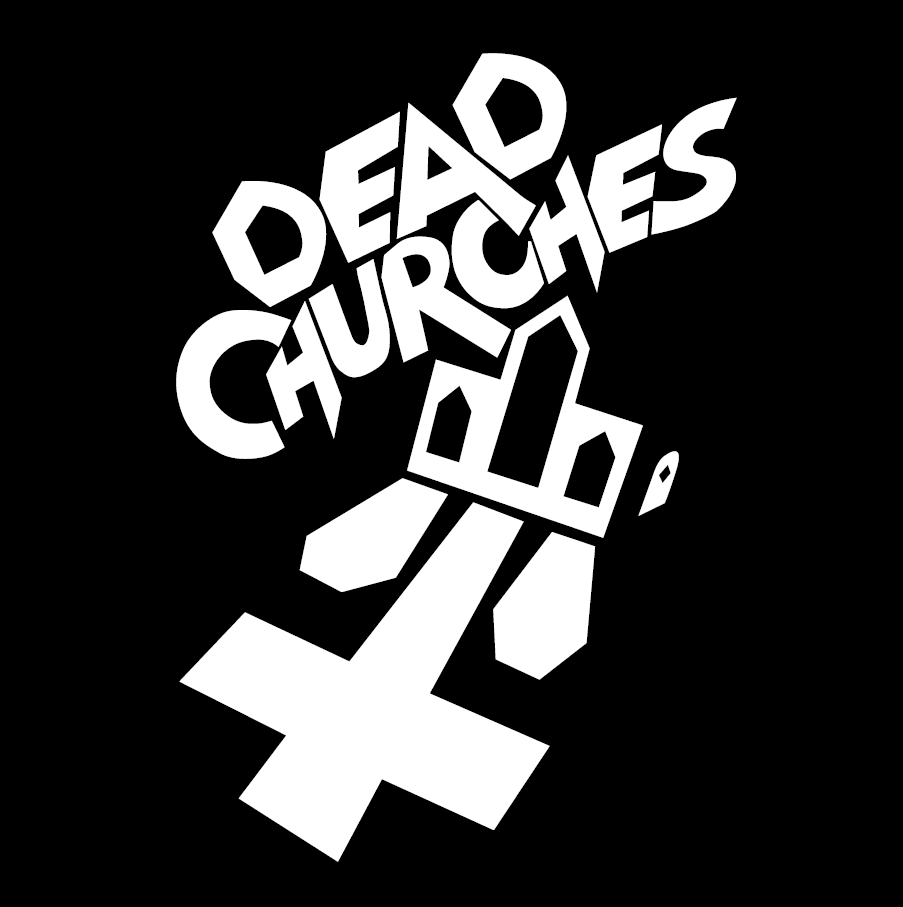
The original Dead Churches logo featured a bold, angular font paired with a stylized church building, rendered in black and white. The design—crumbling church windows and a reflection that resembled caskets and a flipped cross—evoked strong themes of death, religion, and darkness, which matched the band’s identity. However, while the logo was visually impactful, the band felt the font itself needed improvement. Specifically, they wanted the type logo to be more versatile, adaptable for use across merch, albums, and future icons.
The band requested an updated type logo that took inspiration from the font on the cover of the movie Evil Dead. While the original artist had done a commendable job of extending the limited set of letters from the movie’s title, the band felt the font lacked the cohesion needed to stand on its own.
My Creative Process:
When I approached the revision, my main priorities were balancing readability with staying true to the iconic Evil Dead style. I wanted to create a type logo that could be used for a wide range of applications, from letterhead to merchandise, while remaining versatile enough to adapt to different color palettes.
To achieve this, I started by referencing the letters from the Evil Dead title and visualizing how to create the missing letters for “Dead Churches.” I used Affinity Designer to make sure everything was symmetrical and consistent, employing custom guides to ensure equal letter heights, widths, and proper kerning. The font logo was split into two lines: “Dead” on the top and “Churches” on the bottom, maintaining balance while keeping the visual weight where it needed to be.
Challenges and Solutions:
One of the toughest aspects was creating the missing letters in the exact style of the existing ones. Since the letters “C,” “H,” “U,” “R,” and “S” didn’t appear in the original font, I had to use my imagination and artistic skills to construct these letters while making sure they looked cohesive. This involved creating multiple variations for the band, including an option where the “A” in “Dead” extended into the “H” in “Churches,” and even a version where the “H” extends into an upside-down cross—a nod to the band’s darker themes.
Band Feedback:
The revision was actually a one-and-done process. I provided the band with several variations, and they were extremely happy with the results. They’ve since used the logo across various media, including custom shirt designs where the font logo appears in red, and others where the logo is paired with the newly created icon.
Creating the ‘TV with Devil Horns’ Icon for “Bad Year”
The second project was designing a custom icon to represent the song Bad Year. The band provided a concept for the icon—a vintage television set with devil horns on top and a broken heart displayed on the screen. The icon ties into the song’s lyric, “When a TV screen is enough to break your heart, keep your mind dancing in the dark,” capturing themes of heartbreak, addiction, depression, and the emotional weight of personal hardships.
Design Interpretation and Process:
To bring the concept to life, I started with a series of sketches based on their description. The idea of the devil horns replacing the old antennae was both symbolic and stylistically on point for the band’s image. I mocked up four basic versions to ensure I was headed in the right direction before refining the final design.
The finished icon features a vintage TV with devil horns protruding from the top, a broken heart on the screen, and static lines that resemble an electrocardiogram. This creates a visual representation of heartbreak and despair—evoking the idea that once, the TV may have been a source of connection or love, but now only displays static, mirroring a sense of emptiness. The bold outlines and limited color palette—red, black, and white—keep the design visually striking and cohesive with the band’s other graphics.
Key Artistic Decisions:
The level of detail was particularly important for this design. While the icon needed to communicate a lot (heartbreak, despair, and overcoming hardships), it had to remain simple enough to work on a small scale, such as on merchandise. The contrasting color palette and clean, bold lines help maintain that balance.
Band Feedback and Usage:
The band loved the design and has already used it on shirts featuring the new type logo. While this icon was initially created to accompany the song Bad Year, it represents a larger trend in the band’s efforts to build a visual identity that can extend into a broader clothing and merch line.
Both the updated type logo and the custom “TV with Devil Horns” icon play vital roles in enhancing Dead Churches’ visual identity. By working closely with the band and understanding their vision, I was able to create designs that are versatile, impactful, and true to their brand. I’m excited to continue collaborating with them on future projects as they expand their imagery and merch line.