Creating the “Hot Ice” Logo: A Nod to Nostalgia and Team Spirit
When my friend Mike, the coach of our softball team, came to me with a very specific vision for our team’s logo, I knew it was going to be a unique project. Our team, ‘Hot Ice,’ draws its name from a memorable quote in the 1993 baseball movie Rookie of the Year. In the film, the eccentric pitching coach, Phil Brickma (played by Daniel Stern), shares his secret for injury recovery with the young rookie, Henry Rowengartner (played by Thomas Ian Nicholas):

The key to being a big league pitcher is the 3 R’s: readiness, recuperation, and conditioning! You see, after the game, a lot of guys like to ice up their arm. Still, other fellas think that heat is the way to go. But I have discovered the secret, Henry: hot ice! That’s right: hot ice. I heat up… the ice cubes! It’s the best of both worlds!
Phil Brickma
Mike’s idea was to feature an image of Phil Brickma inside a Chicago Cubs logo—a nod to the team in Rookie of the Year. This specific ask was rooted in the team’s sense of humor and nostalgia, and I was excited to bring it to life.
Collaborating on the Concept
Working closely with both Mike and our team captain, Yosuke, we began developing the logo. Mike had a clear vision, so I started by finding images of Phil Brickma that I could trace using the pen tool. This allowed me to create a vector image of Brickma, who would become the central icon of the logo. I then placed him inside the classic Chicago Cubs logo, with the distinctive “C” subtly positioned behind him.
Color and Design Choices
We kept the color scheme true to the Chicago Cubs’ iconic red, blue, and white. These colors not only honored the original logo but also played into the team’s name, with red and blue symbolizing ‘hot’ and ‘ice’ respectively. While we experimented with various designs, including ones that featured melting ice cubes, we ultimately decided that the simplicity of the Cubs-inspired logo, with Brickma as the focal point, best captured the essence of the team.
Challenges and Refinements
The process wasn’t without its challenges. We explored different concepts, and it was frustrating at times when designs didn’t come together as we had hoped. Creating something that visually represented “hot ice” proved to be tricky. But in the end, we found that the humor and nostalgia behind the Brickma-inspired logo were what truly resonated with us.
The Final Design and Team Reception
Both Mike and Yosuke loved the final design, and so did the rest of the team. The reception from others has been mixed—mostly because the movie reference is niche enough that many people don’t immediately get the joke. But that’s part of the fun for us! We enjoy explaining the story behind our team name and logo, adding to the playful spirit of our team.
Extending the Brand: The ‘Hot Wheels Hot Ice’ Logo
After the success of our original Brickma-inspired logo, the team and I decided to push our branding even further. We came up with the idea of recreating the iconic Hot Wheels logo but with our own twist—changing it to ‘Hot Ice.’ The vibrant red and yellow design perfectly complements our blue jerseys and aligns with our team’s playful and nostalgic style.
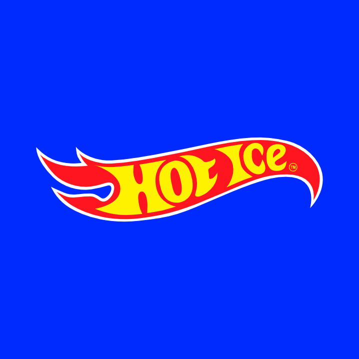
We’ve even had stickers made with this new logo, and there’s been talk of using it for future swag or content. While the team’s Instagram account hasn’t been active yet, this logo gives us a fresh, fun visual identity that we might use to kickstart some posts and connect with others online.
Adding a Personal Touch: The ‘Hot Ice’ Baseball Card
As part of this project, I decided to create a playful piece of content that ties into our team’s branding. Using Photoshop (or GIMP), I designed a custom baseball card featuring myself pitching in my Hot Ice jersey, complete with the Brickma logo and my name. While it’s not a professional-level design, the quick and light-hearted approach added a fun, memey element that my teammates really enjoyed.
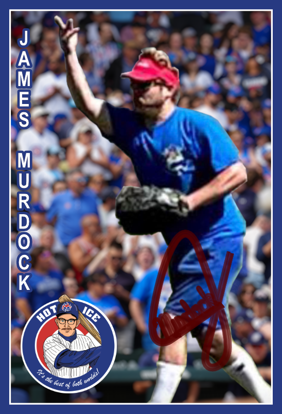
The card also serves as a visual nod to the overall theme of nostalgia and humor that runs through our team’s identity. Including this image in the blog post felt like the perfect way to complement the story behind the logo and further showcase the creative spirit that makes our team unique.
A Personal Takeaway
This project came at a time when I wasn’t doing much design work, but it reignited my passion for it. The positive feedback from the team led to other opportunities, including designing a band logo and icon for Dead Churches. More recently, we’ve started expanding our team’s branding to include our new alternate logo inspired by the Hot Wheels logo, seen above.
It’s been a rewarding journey seeing our team’s identity come to life through these designs. I appreciate you taking the time to read about our creative process, and I hope it inspires you in your own projects. Stay tuned for more updates as we continue to build on the fun, nostalgic spirit that makes Hot Ice so special!