Crafting the Occult: Designing the “Shadow & Shear” Logo
Designing a logo is always an exciting challenge, especially when the brief involves blending styles as distinct (yet complementary) as Art Nouveau and Occult. My recent project for Shadow & Shear, a hair salon with an edge, was exactly that—a fusion of elegance, mystery, and a bit of cosmic flair. So, how did I go from sketch to final logo for a salon that’s more than just cuts and color?
The Visual Elements: Art, Craft, and Cosmic Energy
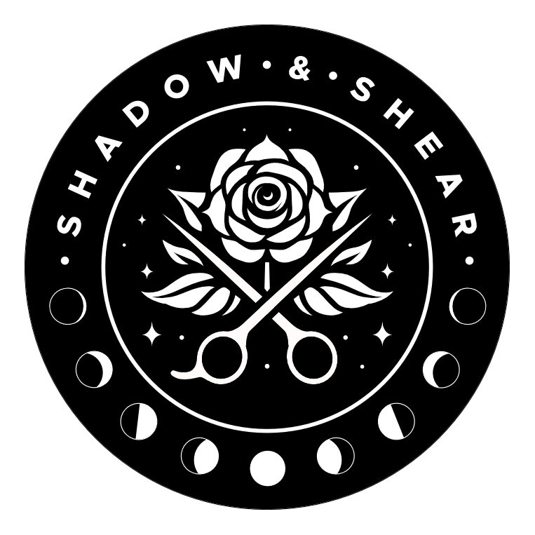
The final logo is simple but filled with symbolism. It’s a circular black-and-white design, featuring a white rose crossed with a pair of scissors in the center. This combo says a lot about the salon’s brand identity. The rose represents beauty and purity, while the scissors are, of course, the tools of the trade—symbols of precision and craft. But there’s more to it than meets the eye.
Around the rose and scissors, I added a ring of crescent moons and stars. The moons symbolize phases and cycles (think of how many transformations you can go through in one haircut), while the stars tie the design to something greater—a cosmic sense of mystery and allure. These celestial symbols give the logo its “occult” vibe, suggesting the salon offers not just style but transformation on a deeper, almost magical level.
The text “SHADOW & SHEAR” curves around the outer edge, framed within the circle, using Metropolis Extra Bold in all caps. This modern, geometric font adds a bold, sophisticated touch, balancing out the natural, flowing elements of the rest of the design. It’s clean, it’s clear, and it’s eye-catching—a solid reflection of a salon that’s both edgy and elegant.
Inspiration and Client Collaboration
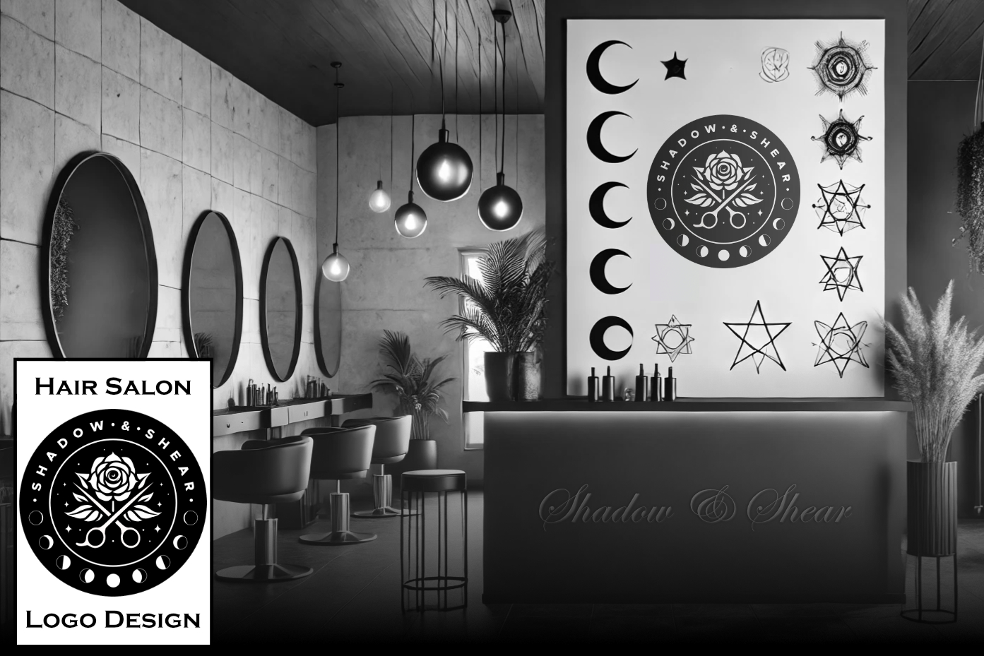
The salon owner was fantastic to work with—they knew what they wanted from the get-go. Armed with a detailed sketch featuring the rose, scissors, moons, and the name in cursive, they made my job both easier and more focused. The vision? Something artistic, asymmetrical, and in a classic Art Nouveau style. They also wanted the moons to give the logo that perfect occult edge. When a client is this clear about their desires, it becomes more about refining and enhancing the vision rather than searching for it.
I did initially run a bit too far down the Art Nouveau rabbit hole, creating several mockups with flowing hair and asymmetrical designs that I personally loved. But I had to step back and focus more closely on their original sketch. Sometimes as a designer, you fall in love with your own ideas—but at the end of the day, the client’s vision comes first. After a few revisions, we landed on the perfect balance: their original idea, with just enough of my input to give it a polished, professional feel.
A Few Tweaks Later…
The client’s feedback was refreshingly clear and professional. They were decisive and asked for a few simple changes to refine the design, like removing shadows from the rose to create a cleaner, more modern look. Once I made those adjustments, we were good to go. They were thrilled to see their idea brought to life in a logo that captured both their artistic vision and the identity of their salon.
Colors and Symbols: Black, White, and Everything In Between
The choice to stick with black and white was deliberate—and packed with meaning. Black evokes mystery, sophistication, and elegance, while white brings in purity and balance. Together, they represent duality—light and dark, known and unknown, much like the name “Shadow & Shear” itself. It’s a timeless, striking contrast that works perfectly for a salon that’s more than just cuts and color—it’s about crafting transformations, both subtle and bold.
Target Audience: Style Meets Substance
While we didn’t dive deeply into brand identity discussions, it’s clear that Shadow & Shear knows their audience. The logo is designed for clients who love high-end, artistic craftsmanship and probably rock some amazing hair color transformations. The symbols, the imagery, and the overall aesthetic reflect a brand that’s modern yet mystical, combining beauty with a sense of cosmic wonder.

This project was a fantastic journey through symbolism, style, and client collaboration. The final logo feels like a perfect visual representation of a salon that combines traditional craft with something a little more magical. If you’re looking for a logo that’s more than just a pretty picture, get in touch!


